Product detail page redesign
- Challenge
- Align the product detail page with the new brand identity and improve the product selection experience
- My contribution
- Concept adaptation, above-the-fold design, product information, spacing system, and guidelines
- Team
- Product manager, designers, iOS, Android and backend engineers, QA engineers, and analysts
- Metrics
- CR to CartAdd · RRR
Context
The product detail page is where shoppers decide whether to buy. For a long time, we improved it through individual changes, adding elements and flows in the hope of improving metrics. But the experiments introduced too much change at once. Users did not respond well, and we repeatedly had to roll back to the 2022 version.
Product information
The product information section was a good example of one of these large experiments. Qualitative and quantitative research highlighted problems with how shoppers understood the section and how product attributes were presented. I rebuilt its structure and created guidelines for filling in product information.
We developed the design and launched an A/B test, but the results were inconclusive. This suggested that the problem extended beyond one section: the whole page was so overloaded that users were not noticing individual improvements.
Why redesign the page?
At the same time, Lamoda began a major rebrand. Its new visual language needed to carry through to the product. We chose to start updating the app at a key conversion point: the product detail page. We already had a foundation of improvements; the next step was to bring them together in a consistent style.
Hypothesis
If we simplify the page visually, put product photography first, make size selection calmer, and structure product information, then shoppers will find it easier to decide what to buy. Previous experiments suggested that the page was too overloaded for users to notice isolated improvements, so we needed to rethink the entire screen.
Solution
We divided the work among the designers on my team. I took ownership of the key sections: the photo gallery, product name and price, size selection, and product information. I was also responsible for assembling the final page and checking it against our guidelines.
One goal was to reduce visual clutter, focus attention on what mattered, and make room for future features. I combined our earlier work with a review of the page’s existing features and their effectiveness.
Above the fold
The information visible when a shopper opens the page is critical to keeping their attention and helping them move toward a purchase. I emphasized photography and removed unnecessary elements. Shoppers could now add the product to their wishlist or cart, or share it, directly from the first screen. The brand, rating, and price also remained in view.
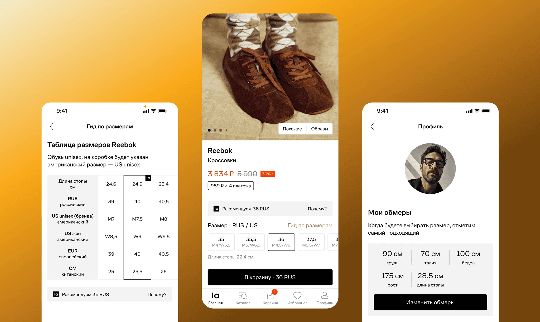
Size selection
Size selection was another pain point. Research showed that the overloaded section, scattered controls, and labels confused users. Back-in-stock notifications also caused problems: selecting an unavailable size subscribed users automatically, without a way to cancel.
I focused on reducing visual noise and making size selection calmer while preserving all existing functionality.
I also redesigned the back-in-stock flow. Shoppers can now manage their subscriptions on the product page and view measurements for sizes that are out of stock.
I updated the size advice modal too. Research showed that shoppers did not understand where our fit information came from. The new design shows the distribution of customer feedback to make the advice more trustworthy.
Product information
In the previous experiment, I had already grouped and prioritized product attributes. For the new page, I changed the structure to expandable sections with descriptive headings. This was intended to reduce cognitive load and help shoppers focus on the information they needed.
This time, we wanted to test whether the updated section actually worked better than a standard list. I also prepared a version of the old structure in the new visual style, so we could compare how well shoppers understood each option.
Results
We stopped the first experiment early because NMV was falling quickly. We knew this was a possible outcome; the priority was to understand why.
Our analysis revealed a chain of effects. Adding products to the wishlist had become more visible and convenient, so shoppers saved products instead of adding them to the cart. But the purchase journey from the wishlist was longer: its product cards had no Add to cart button.
We closed that gap by adding an Add to cart button to wishlist cards. Among users who visited the wishlist, CR to CartAdd increased by +0.29%; overall, it increased by +0.1%. The returns guardrail metric remained neutral.
In the next version of the product page, we moved the wishlist button back to its previous position. The team is testing these iterations.